an interesting graphic
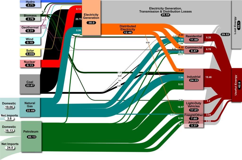
Sep. 8th, 2009 02:36 pmFrom Lawrence Livermore National Labs, old link an interesting graphic showing the flow of energy in the US (units are, I believe, 10^15 BTUs).
It implies some unsurprising things, like we should stop driving SUVs and turn off the lights when we leave the room. But it also implies some more interesting things:
It implies some unsurprising things, like we should stop driving SUVs and turn off the lights when we leave the room. But it also implies some more interesting things:
- US natural gas usage exceeds
demanddomestic supply; switching from oil to gas might improve efficiency some but isn't going to change our petroleum imports much. - Electricity generation and distribution is nearly as inefficient as a passenger car and mostly coal-fired to boot. Plug-in hybrids don't help the big picture unless they're also part of some kind of distribution efficiency improvement.
- Freight is pretty efficient comparatively speaking. Dicking around with how we power semis is not going to help much.
- Doubling solar every 18 months (the current growth rate and not coincidentally equal to the doubling time in Moore's Law) won't even be noticeable for over a decade. It will take WWII-level increases in production for this to make a difference.
- Doubling wind could make a difference sooner than that, and even fractional differences in nuclear output would make a big difference.
- Geothermal makes a bigger difference than you'd think.